Responsive layouts in WordPress and the Block Editor
The development on Advanced Columns is proceeding well, in anticipation of the release of the Pro version, which will see the light in the coming months. In anticipation of the introduction of the advanced version of the plugin, we want to take the opportunity to illustrate the modus operandi of the plugin when it comes to designing for multiple devices.
Over the past dozen years, Media Queries have been the cornerstone of responsive design and, in fact, the main methodology for creating layouts that adapt to different contexts. Despite the pressing requests from a part of the community, to date, the architecture of the Block Editor does not natively include the use of Media Queries to alter the presentation of blocks on the page, and, as expected, this condition has led various plugin and theme developers to develop proprietary solutions to meet market needs.
We have already emphasized how page builders are somewhat experiencing a second youth: among the plugins that have attracted more consensus in the last year, we find Bricks and Cwicly, two different but somewhat similar products that aim to offer an all-inclusive solution that fundamentally replaces the experience designed by WordPress for editing and developing a project.
Regarding Media Queries, both of these tools implement their own solution to the problem, offering out-of-the-box three breakpoints (in addition to the base desktop setup), and the ability to create custom ones by indicating the viewport width. Cwicly, moreover, stands out for offering the possibility to generate breakpoints based on the syntax of Tailwind CSS, an approach that evidently appeals to the many developers who are already familiar with such framework.
In the Block Editor, the only reference to responsive design is currently represented by the content preview mechanism, which simulates three different environments: Desktop, Tablet, and Mobile. By clicking on a specific resolution, the content is displayed in a context with a fixed, predefined width, namely 780 pixels for the Tablet context, and 360 pixels for Mobile. This approach, indeed rather limited, does not align well with the customized solutions implemented by the plugin producers mentioned earlier: for this reason, such producers implement their own proprietary preview system, consistent with what is defined in their configuration options.

As always happens in cases where the user experience of a tool is fragmented, the price to pay risks being the confusion of those who will use it.
The Block Editor and Full Site Editing
The Gutenberg project is fundamentally based on the design approach called intrinsic, a term coined by Jen Simmons in 2018.
Let’s take a brief step back in time: over the last fifteen years, the number of devices on which it is possible to run a browser and load a web page has increased significantly, and with it, the variety of resolutions and sizes of their respective viewports. The direct result of this extremely varied landscape is that it is not always possible to set up a set of Media Queries and be certain that such a setup will cover all cases.
Intrinsic design represents a significant change in perspective compared to the approach that uses Media Queries: instead of presetting fixed size ranges to define a context, fluid measures and logics are used for the various components, so that they naturally adapt to the width of the viewport, whatever it may be, thus providing a response to the problem of the abundance of resolutions of the different devices currently on the market.
This choice of avoid using Media Queries entirely in the Block Editor has certainly proved to be extremely intelligent from a development perspective, as it has allowed the Core team to reduce and manage the complexity of the UI and UX of the project, already far from simple in itself.
On the other hand, this type of approach requires a change in mentality on the part of the user, both in terms of design and development; experience teaches us that such changes come with a certain cost, typically expressed in effort and commitment, and therefore are never immediate for everyone, especially if they come from other systems, such as those mentioned earlier, which represent drastically different working environments.
Advanced Columns and a more complete management of responsive design
Although recommended, the intrinsic approach cannot, by its nature, cover every single need and, like all working methodologies, cannot be considered the only path to undertake to implement a design.
With Advanced Columns, we not only aim to create the most advanced and complete system for creating layouts, but we also want to introduce a mechanism for managing responsive data in WordPress that is capable of allowing the user to manage any type of Media Query or Container Query, thus simultaneously embracing both philosophies.
As the market stands today, there are no systems capable of handling Media Queries that go beyond specifying the viewport width (the system we have designed will handle any type of Media Query, whether sizing or preference), nor systems that make use, at any level, of the latest Container Queries.
Responsive data and the inheritance system
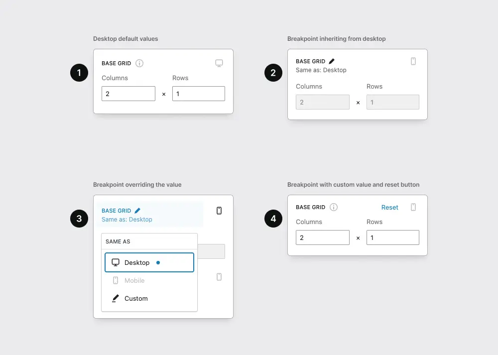
In the previous paragraph, we briefly mentioned the issue of managing responsive data. In Advanced Columns, what we have managed is the following case: for each data that one potentially wants to modify for a certain range of responsive values, the stored value on the page should not be the value itself, but an object that says what the value of that property is in a given context.
The choice of how to structure the saved data was relatively simple. The complexity arose from the fact that CSS is a system that makes inheritance of properties one of the main pillars of the entire architecture. To make Advanced Columns truly versatile and cutting-edge, we wanted to imagine an inheritance mechanism, both backend and frontend, that was flexible enough to handle any type of condition.
What do we mean by the inheritance system?
Imagine having the three classic breakpoints presented in preview mode of the Block Editor: Desktop, Tablet, and Mobile. Our block can be configured differently depending on each of those contexts, therefore, when we find ourselves customizing an attribute at a specific breakpoint, it is likely that the other data should not be changed and therefore should inherit the value from another breakpoint.
For example, if we are configuring an attribute in Mobile view, it might be necessary to inherit a value from the Tablet breakpoint instead of Desktop.
From the UI point of view, in our solution we tried to remain as consistent as possible with the WordPress design system, although this behavior is not provided for in their guidelines, effectively creating an interface that makes it clear to the user when a value is inherited from another context.
Also, if such value has already been modified, we offer a clear way to reset the data to the default value, which in Advanced Columns corresponds to inheriting it from the default breakpoint, namely Desktop.
The concept of inheritance itself is currently still under discussion within the Gutenberg project as far as the style data is concerned, to make the connection between what is global style or style declared in the theme.json file clearer, and any customizations made by the user on a specific block.
What are the limits of this approach?
In products like the aforementioned Cwicly or Bricks, as they carry out a complete redesign of the interface, controls have also been created to modify the preview area according to the breakpoints defined by the user.
In Advanced Columns, instead, we chose not to interfere with the editor’s UI, already complex enough on its own, and we had to compromise and create a mechanism for editing and previewing that allowed editing a value of an attribute at a specific breakpoint without resizing the viewport but still having a view as faithful as possible to the block’s behavior in that specific context.

It is evident, however, that this can only be a partial system by its nature, since the responsive controls of Advanced Columns are exclusively available on our block, and customizing what happens at a specific breakpoint for content blocks added inside a column is simply not possible.
In the future, if the Block Editor were to make the preview control extendable at will, we could better integrate our breakpoint system to offer an even better preview experience.
Conclusion
We don’t know exactly which direction the Block Editor will take regarding the management of responsive aspects, but we know that the issue is on the table, and there are countless discussions on the topic, some of which seem to propose some kind of solution.
What is certain is that for these topics, and likewise for many others, the development of Advanced Columns is following a well-defined roadmap that we will be happy to share with everyone at the appropriate time, and that includes the introduction of Container Queries as a feature on day one in the Pro version.
We would also like to make our breakpoint and Container Query generation system available outside of our plugin, for example, to other custom blocks provided by other tools, but we are aware that as exciting of a prospect this represents, it will also require quite a bit of work on our part.