The roadmap to a better UX: the layout creation
With the 1.0.8 release of Advanced Columns, we are initiating a series of updates focused on UI/UX improvements, aiming to enhance the block’s usability, particularly for users who don’t need to create complex grids, or simply want to provide a more straightforward experience for their clients.
In this post, we’d like to take a moment and illustrate the changes that we have in mind for the upcoming plugin updates in terms of user experience.
Layout composition split
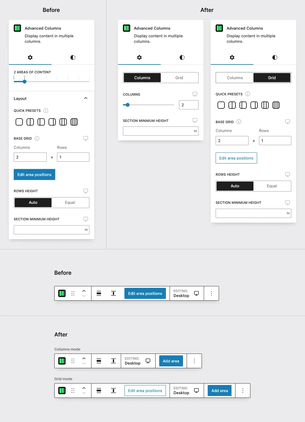
In version 1.0.8, the aspect that we analyzed regarding layout composition is the creation of areas. Since the slider used in the previous version could be easily confused with the “Columns” count slider of the Core block, we have decided to remove it.
Instead, we now use a button in the main toolbar that performs the same action.
This change allows us to eliminate the “limit” on column creation that was added due to the nature of the range control. We have also brought the area creation into the content editor area, making it clearer for the user, as the new area will appear in the same space.
The second aspect that we tackled is related to the grid composition itself. We recognize that not every user may require a multi-dimensional grid, the management of which can be a little overwhelming.
Despite that still being the key component of the plugin, we decided to offer a simplified way of creating a layout, still based on CSS Grid, but only managing columns, with rows being dynamically generated.
This change allows us to simplify the interface significantly by creating only a new responsive range field for the number of columns.
With the new semantics in place, we now have the “Columns” mode for a standard CSS Grid-powered columns layout and a “Grid” mode for the multi-dimensional grid made by columns and rows.

The key difference between the two modes is the behavior of the individual columns.
In the “Columns” mode, since there is no single area dimensioning, columns can be sorted with the block mover control (like in the Columns Core block). Instead, in the “Grid” mode, with individual area placement, the “Edit area positions” control is the only way to move the areas around on the grid.
In a nutshell, we felt like the appropriate move here was to provide different controls for different scenarios.
Gap improvements
The layout mode introduced in version 1.0.8 represents the initial phase in our roadmap to improve the block’s UX.
The next stage will involve optimizing the Gap controls that controls the spacing between columns and rows.
From the technical point of view, we’ll be restructuring the attributes data by merging the columns and rows gap attributes into a single one. This will enable us to create a linkable field, similar to the spacing field that we’re already using, enhancing the most common scenario when both fields have the same value.
By doing this operation on the Gap fields, we realized that a similar approach could be used to make adjustments to the spacing fields as well, namely the margin and padding, in terms of attributes data management.
This entails altering how unlinked values are structured, and we think that this modification will prove particularly useful for the ‘Pro’ version we are currently developing.
Global presets
One crucial aspect of our block is its seamless integration into a theme style guide. Therefore, in a future update, we will introduce a new panel in the global Settings to manage block presets.
The primary concept here is to provide a means of defining, for each Media Query specified in the Settings, a set of default values for various fields such as Gap or the Mode control. For instance, in a specific project, you could dictate that every time an Advanced Columns block is added, it will automatically use to the “Grid” mode, and default to 1.5rem spacing between columns.
These ideas are only the beginning in our journey towards a more user-friendly experience for the plugin, so stay tuned for further updates!
