Column layout
The new column layout mode serves as a replacement for the WordPress core “Layout” option. This means that if you have previously used the WordPress core “Layout” option, the custom value set in the “content” field will now be applied as the max-width for the column.
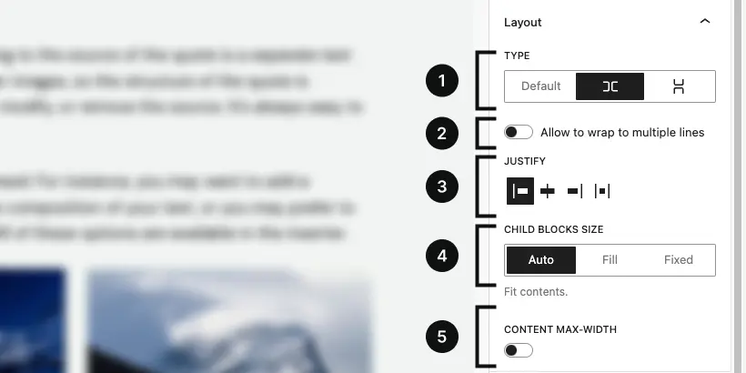
Type
The type control allows you to modify the CSS display property of a single column. By default, the column is set to block, but you can change this to flex with two different layouts: row and stack.
- default: This option corresponds to display: block, meaning that the column will behave like a standard block element, stacking vertically by default, occupying the full width of its container.
- row: This option sets the column’s display to flex with a row layout
(display: flex; flex-direction: row;). Elements inside the column will be arranged horizontally, aligning side-by-side. - stack: This option sets the column’s display to flex with a column layout
(display: flex; flex-direction: column;). Elements inside the column will be stacked vertically, one on top of the other, similar to the default block behavior, but with the flexibility of flexbox for alignment and spacing.
This control gives you flexibility over how the content within the column is structured and aligned, allowing for more dynamic and responsive designs.
Wrap
The “Allow wrapping to multiple lines” control is available only when the “row” type is selected, meaning when the container is set to use display: flex with flex-direction: row. This control enables or disables the ability for child elements to wrap onto multiple lines, applying the flex-wrap: wrap property when activated.
When enabled, this setting allows child elements that would otherwise overflow the container’s width to automatically wrap onto new lines, ensuring that the layout remains responsive and avoids horizontal scrolling or content overflow. This is particularly useful when dealing with dynamic or variable-width content, as it helps maintain a clean and organized layout even when there are too many child elements to fit within a single row.
Justify
The justification controls are displayed only when the “row” or “stack” type is selected.
These controls allow you to choose between left, center, or right alignment.
When the “row” type is selected, you can additionally choose the “space between” option, while with the “stack” type, you can opt for the “stretch” alignment.
Child block size
The child block size control allows you to specify the sizing behavior for all direct child blocks within the container. This control becomes available only when the type is set to either “row” or “stack” (i.e., when the container uses display: flex). You can choose between three sizing options: auto, fill, and fixed, which correspond to different CSS flex properties:
- auto: This option corresponds to the default behavior, where the size of each child block is determined by its content and other CSS rules. The flex-grow property is set to 0, meaning the child block will not grow to fill any extra space in the container, but instead will take up only the space it needs.
- fill: This option sets the flex-grow property to 1, allowing child blocks to grow and fill any available space within the container. If multiple child blocks use the “fill” option, they will share the available space proportionally.
- fixed: This option allows you to set a specific size for each child block by using the flex-basis property. The child blocks will have a fixed size that you can define explicitly, and they will not grow or shrink based on the available space.
These options give you precise control over the layout behavior of child blocks in flexbox containers, allowing for dynamic sizing or fixed-width configurations depending on your design needs.
Content max-width
The content max-width control allows you to define the maximum width for a single column container. By setting a max-width, you can limit the column’s expansion, ensuring that it doesn’t stretch beyond a certain width, even if there is additional space available in its parent container.
Need more help? Contact us
Updated