Media Queries
Advanced Columns is designed to put you in control of the behavior of your layouts, by giving you the tools to handle its responsive logic.
Another goal of Advanced Columns is to give you direct visual feedback about how your content will look at different view sizes, right in the Block Editor, without the need of switching to Preview mode, or being forced to save the page.
You can create or modify Media Queries breakpoints in the plugin Settings Page.
Please note that in the free version of the plugin, you can add only two breakpoints. The default desktop breakpoint is added automatically.
In the editor
For the Columns and Column blocks, many settings offer responsive support: this means that for those settings, you’ll be able to set completely different values for different breakpoints.
When editing content, an active query is defined at page level: this means that Columns and Column block will display according to the settings that are valid for that specific Media Query.
If a block control supports responsiveness, an edit button will be shown next to the control label when changing the active query.
By clicking the button or directly on the field, you’ll be able to edit the values for the corresponding active query.
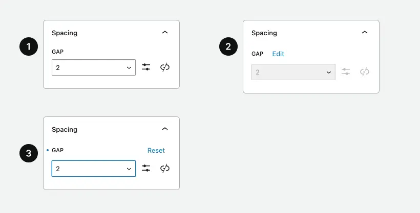
- Field in the Base query mode.
- Field in a "mobile" query visualization.
- Field in a "mobile" query with an overridden value.
Upon first installing the plugin, a “Desktop” and a “Mobile” Media Query are automatically created for you to use: its breakpoint value is set to the same value that WordPress Core is using to target mobile devices.
Of course, this value can be modified in the plugin Settings Page.
Breakpoint toggle
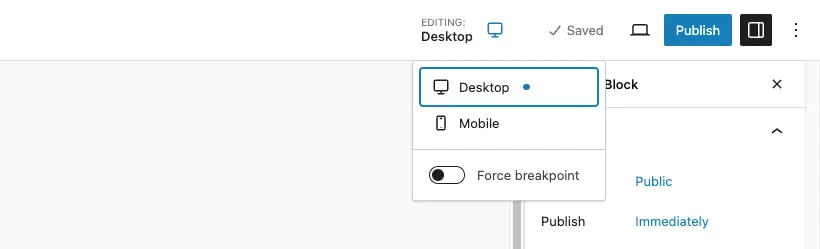
The editing workflow for responsive values is managed by the breakpoints toggle located on the top right toolbar in your editing screen (post editor, site editor, or pattern editor).
Each breakpoint defined on the settings page will appear in this toggle, and by clicking on a specific breakpoint, the editor will be resized to provide a more realistic preview of what will be rendered on the frontend.
When a breakpoint is enabled, it will stay active until you decide to change it manually.
Breakpoint force
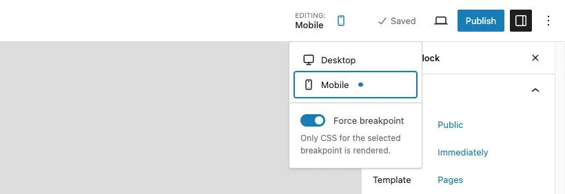
In some specific cases, you may have a breakpoint to edit that cannot be visualized in your current viewport width. By clicking on the ‘force’ control, only values of the selected breakpoint will be rendered, in order to bypass the browser’s natural breakpoint detection.
Need more help? Contact us
Updated