Media Queries management
The “Media Queries” section allows you to define the breakpoints that can be used in Columns and Column blocks, for all controls that support responsiveness. By default, when the plugin is installed, a “mobile” breakpoint is automatically generated: the value used for the “mobile” media query is the value that is generally used by WordPress Core to target mobile devices.
In the free version of the plugin, it is only possible to create two breakpoints.
Queries mode

The Media Queries Mode allows you to invert the order of the base query from desktop to mobile and vice versa, automatically managing the inheritance logic and Media Queries ordering on frontend.
Creating custom Media Queries
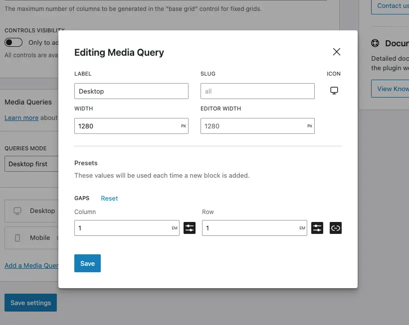
When adding a new Media Query, an editing modal will be presented to you (this feature is only available in the Pro version of the plugin).
The same modal is shown when you click on the pencil icon in a previously-saved Media Query, to edit its value.
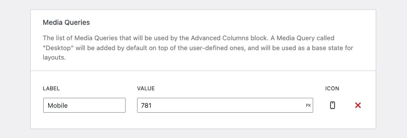
For each breakpoint, you can choose:
- a label
- a slug
- a width that represents the
max-width(ormin-widthif in “mobile first” mode) value for that specific breakpoint - an editor width that is used to determine how wide the editor will become when editing the content at the specific breakpoint
- an icon
Media Queries are automatically ordered, and the inheritance logic is automatically associated with the appropriate breakpoint.
Need more help? Contact us
Updated