Columns block theme supports
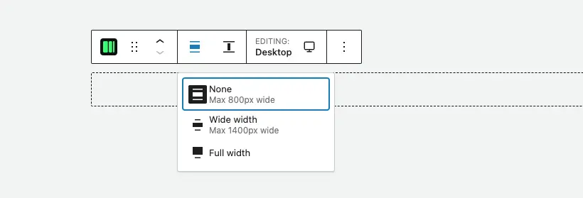
Alignment
Once the support for wide and full alignment is enabled, the Columns block will display the corresponding icon in the toolbar to change the width setting.
How to enable alignment support in a block theme or a standard theme
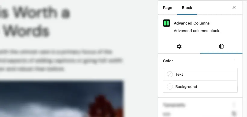
Colors
Colors allow you to configure the background color (or gradient) of the Columns block or the text color for all the blocks contained within it.
How to enable colors support in a standard theme or a block theme
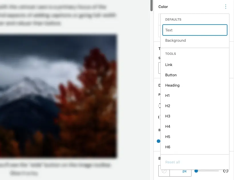
Since version 1.0.2 supports for colors has been extended to all the headings, buttons and links.
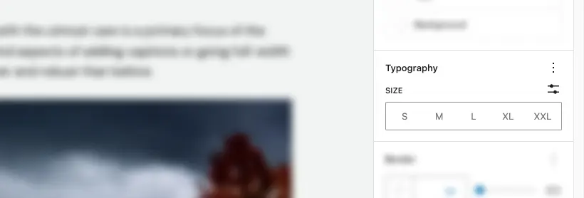
Typography
Through typography controls, you can modify the text style for all the blocks contained within it.
How to enable typography support in a standard theme or a block theme
Position
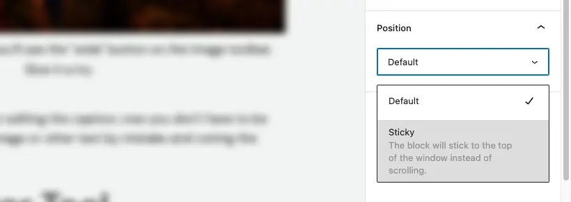
“Position” is part of the appearance tools and enables the ability to make the block “sticky,” meaning it can remain attached to the page once it reaches the top edge of the viewport. To avoid unexpected behavior, it is recommended to use it only on top-level elements in the page content.
How to enable position sticky support in a standard theme or a block theme
Border
The border theme support enables the ability to set a border, including size, color, style, and radius.
How to enable the border support in a standard theme or a block theme

Anchor
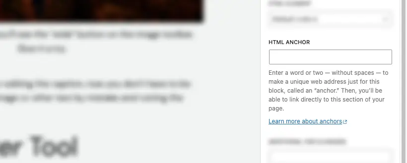
The “anchor” feature, available in the “advanced” tab, allows you to add an ID to the block. This is useful in case you need to reference the block within a link to automatically scroll to the desired section.
Classes
Custom classes can be useful if you need to apply custom styles and can be added from the “advanced” tab.

Need more help? Contact us
Updated